Design
Type, layouts and decisions you never notice.
“Ye Olde Shoppe” was always pronounced “the”
The “Y” in “Ye Olde” is a lost English letter, þ (thorn), in disguise. Nobody ever said “yee”.
Brutalism isn’t named after being brutal
The architectural style people love to hate takes its name from the French for “raw concrete”.
Kazakh has been written in three alphabets in a century
Kazakh moved from Arabic script to Latin in 1929, to Cyrillic in 1940, and is moving back to Latin today. Kazakhs in China still use the Arabic script.
Lorem ipsum is a mangled Cicero quote
Designers’ favourite placeholder text is a scrambled passage from a 2,000-year-old book about pain and pleasure.
Nepal’s flag comes with geometry instructions
It’s the only national flag that isn’t a rectangle, and Nepal’s constitution explains how to draw it, step by step, like a geometry exercise.
The golden ratio is less magic than you’ve heard
φ ≈ 1.618 really does appear in sunflowers and pentagons. Most claims about the Parthenon, the Mona Lisa and “perfect beauty” are myths.
The Post-it Note came from a failed glue
A 3M chemist made an adhesive that barely stuck. It took six years and a slipping hymn-book bookmark to find a use for it.
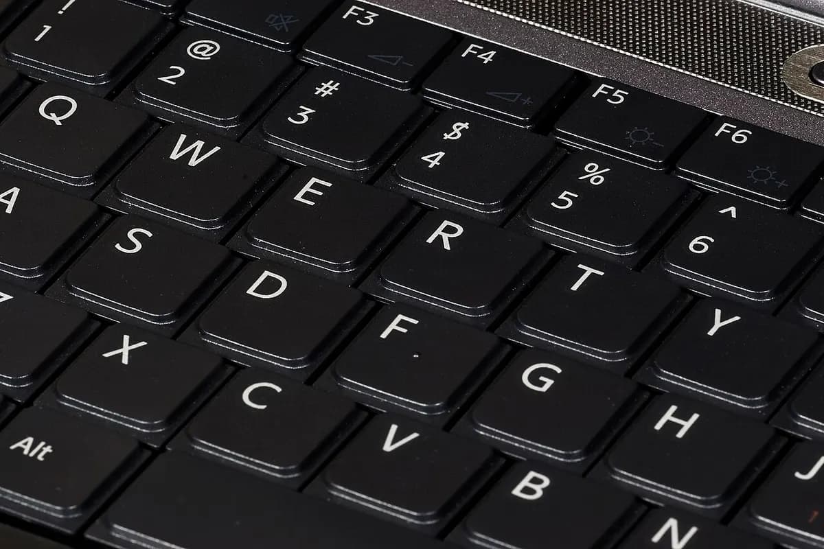
Why your keyboard says QWERTY
The layout you type on every day was designed for a machine that no longer exists, and the famous reason for it may be wrong.